I thought I would write something about how this blog looks and the software behind it because this issue has taken from me not a small amount of time and caused me a great deal of consternation.
My first blog used the Movable Type software. It was simple, easy, looked OK, and you could customize it slightly without too much trouble.
Now, for some reason I can’t remember, it got into my head that WordPress would be better. Perhaps it was because the themes looked better, perhaps it was the GPL license, perhaps some blog I saw and liked used WordPress, perhaps I thought this software is more flexible and would allow me to write some PHP to do amazing things.
So off I go into my shell account and unzip WordPress, set up the MySQL database, run the wordpress configuration script. Then I come up against the default theme… it looks OK, but exactly the same as the million other crap blogs on the Internet. Of course I can’t just visit the themes gallery and install a different theme. It wouldn’t be my own and besides they all look too tryhard.
Now is time to create my own theme that doesn’t look like a blog at all but rather looks like a nice photo-diary type web page. This is hard work. In the end I failed with this. There is too much stuff to customize and the WordPress API documentation isn’t very well organized. Multiply this by my only casual aquaintance with PHP and obsessive need to do write computer programs and web pages properly and in the end you have a Big Waste Of Time.
Wait four or so months and then you have the situation of last week. I was sitting at home twiddling my thumbs thinking wouldn’t it be good to write a blog about my boring life. So I log into the blog admin and change the theme back to default. Then I remember how averse I felt towards its appearance. At this point I downloaded and almost unzipped the Movable Type tarball, ready to start again, but decided against it considering how much time I had already spent with WordPress.
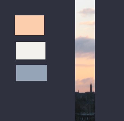
Somehow, a photo I had taken that morning seemed like it would make a good image for the header, and the default theme isn’t too obvious if you just change the colours a little bit.

After spending a little bit of time with the GIMP, and some fiddling around with the stylesheet, this is the end result. My main problem is that the look is such a cliché and it’s clearly a WordPress blog.


Anyway it’s not too bad and WordPress does have some nice plugins and the admin interface is pretty cool. In the end the thing for most web pages is that what you write is important, not how it looks. So just bloody start writing it. This might be obvious for some. But I’ve been taught this lesson too many times in different ways and I keep on making the same mistake.
Thankyou for reading. The next entry I promise will be about something interesting.